DC3 Unveils New Website and Academic Logo
Published September 15, 2017
 On Friday, September 8th, Dodge City Community College unveiled the face of its new website. The web address remained the same (dc3.edu), but the site itself was redesigned to be more contemporary and user-friendly. Along with the redesign, a new academic logo was also chosen for the college with input from faculty, staff, and students. It is hoped that this website will attract more traffic, although most user-friendly websites have gone through with a web audit prior to the redesign stage. If you’re looking for a hosting service for your new website, take a look at alternatives to godaddy. You may want to consider visiting HostiServer for a range of services from web hosting, to speed optimisation and views on your website. But there are plenty out there for you to choose form.
Gardner Design was selected as the company to undertake the project. “When it came to the website, we used the visual components that we developed with the new identity and combined them with a layout that would be fun to explore but also provide the information that new and prospective students need. It was designed for screens the size of iMacs to iPhones, so the experience can be enjoyed on whatever device is handy,” said Jay Walter, Director of Interactive with Gardner Design.
Justin Wilson, DC3 Assistant Director of Marketing, commented that the website is a drastic change. “It’s streamlined and much easier to navigate,” said Wilson. “It’s laid out in a way that is intuitive and easy to get around.”
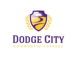
The new academic logo was seen as a progressive step toward the future of DC3, as well. “We wanted the new logo to help communicate some of the best aspects of the college, especially to prospective students. As a result, the new logo has imagery that ties it to its home in western Kansas – such as the wheat on the sides and the rolling plains in the middle of the crest. At the same time, the plains also convey an open expanse without boundaries but with paths that help guide the journey: a metaphor for the many learning paths and possibilities available,” said Adam Anderson, Art director and Designer with Gardner Design.
“We also kept some continuity with the school’s previous logo through the use of the sunburst as well as integrating the current school colors of purple and gold,” he continued.
DC3 President Harold Nolte shared his enthusiasm. “We are so excited for the redesign of the website and the new academic logo. I believe these changes will bode well for us in the future and the website will serve as a tool for potential students to find their path.” So far, feedback about the new website has been overwhelmingly positive. The new look and design of the site make it a more dynamic virtual experience for users: from the ability to take virtual campus tours with an interactive map to more concise menu options. “It’s been such a pleasure to work with the friendly and talented students, faculty and staff at DC3. We’re excited to see how these new tools will help them grow,” said Emily Juhnke, marketing director for Gardner Design.